


What is Méthode Champenoise? How traditional method sparkling wine gets its bubbles
8 min read
7 min read
For months now, we’ve been working on something special—an exciting partnership that brings together the worlds of art and wine in a way that feels uniquely MAWBY. That’s why we were so excited to partner with the College for Creative Studies (CCS) in Detroit on a project that brought together two expressive worlds: winemaking and visual art.
Earlier this year, we invited CCS students to create original label designs that captured the essence of MAWBY—vibrant, expressive, and delightfully unexpected. Some incredibly talented artists rose to the challenge, each presenting a design that reflected their unique point of view. But the creativity didn’t stop at the label—our winemaking team was so inspired by the student artwork that they crafted a custom dosage to complement the chosen design, creating a wine that’s as collaborative as it is delicious.
After thoughtful review, one student’s design was selected to appear on a limited-edition bottle. And to honor the creativity of all participants, each student received a scholarship to support their continued education and artistic journey.
In the spirit of celebration and storytelling, we’re excited to share more about our process, the student designs, and artist statements. Their work speaks to the shared spark of creativity that connects art and wine—and reminds us why we love doing what we do. Read below to learn more about the artists' inspiration and process.
The CCS Cuvée will be available to purchase online beginning September 22nd. In the meantime, keep an eye out, it’s already starting to appear on shelves at select retailers across Michigan.
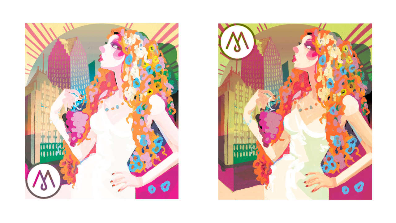
"MAWBY’s brand is known for their high quality products, their overall approachability, and the ability to celebrate any moment - large or small. The company invented the term “MAWBYness” and its essence is energetic, youthful, and creates a feeling of connection. The brand shows a love for nature, which they prove by their environmentally friendly and sustainable farming - never sacrificing the quality of their products for profit. Being tasked to create a wine label with all of this in mind, I wanted to focus on the environment and the sense of community the brand provides."
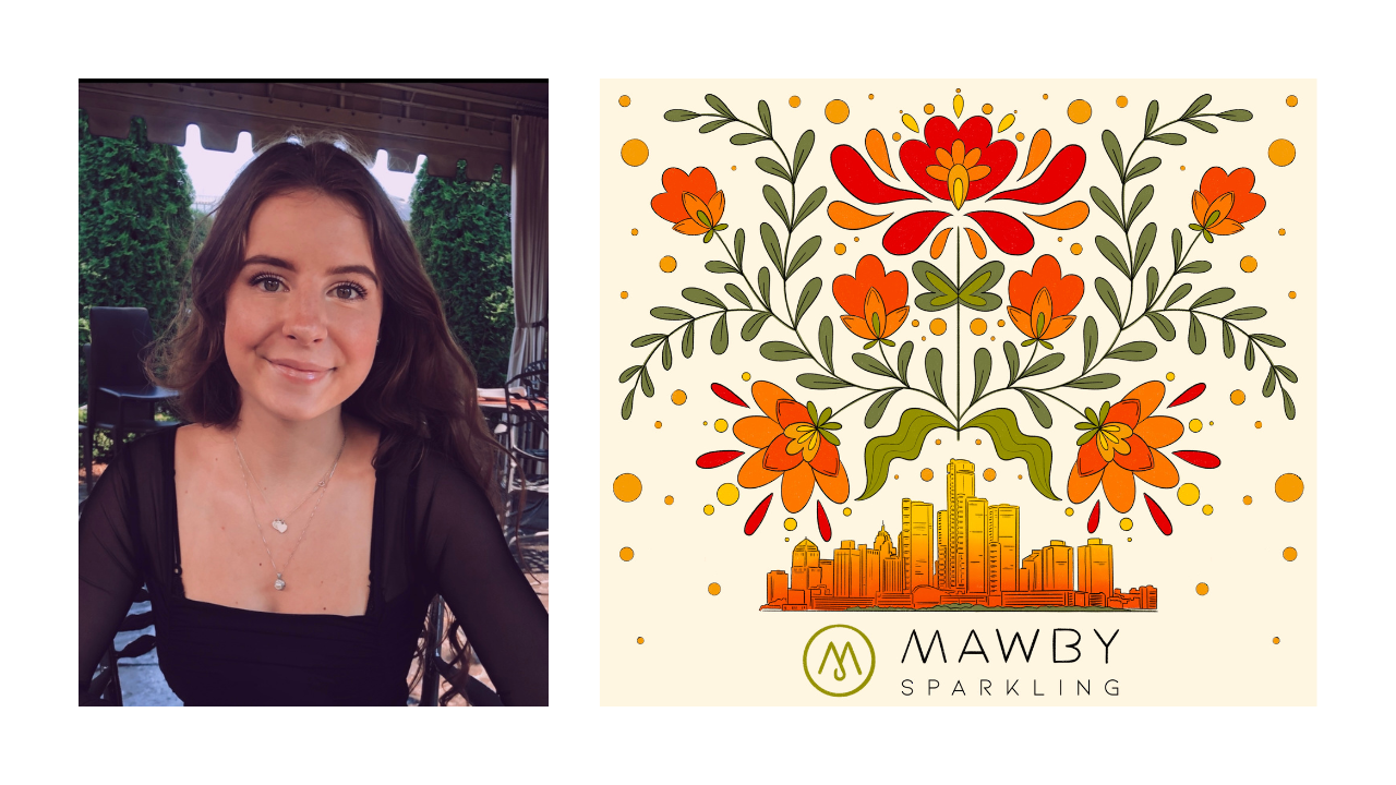
"With my initial sketches, I aimed to capture an organic and youthful design. My Polish heritage heavily influenced this design - folk art filled with brightly colored flowers and foliage. Since the company is greatly rooted in Detroit and has done a lot for the community, I wanted to add the classic skyline to balance the soft, natural look. One of my favorite things to do in the city is watch the sunrise or sunset - the way the colors dance and reflect off the buildings is breathtaking. These vibrant colors and the gradient on the skyline best capture that view."
"This design of flowers and foliage blossoming from the skyline emphasizes the celebration of life and truly brings the essence of “MAWBYness” alive."
"We received many outstanding artistic submissions from the students at CCS. All of them spoke to us in positive ways but one stood out and hit a few different points that really caught our attention. Detroit is a great city. Many of us have some roots in the area and frequently return to enjoy what the city has to offer. Restaurants in the city have served MAWBY wine for years and we are proud that our wine can be a part of the Detroit experience. Olivia's representation of the skyline depicts it as the proud and vibrant city that it is with recognizable landmark buildings and colors that remind you of what a sunset might look like from the riverfront. It literally makes you want to visit the city and enjoy a meal with a glass of wine."
"The flowers are where the inspiration for the wine style came from. Two things you may not associate with each other are big cities and fields of flowers but the color scheme used by Olivia brought the two together here very well. We wanted to do the same thing with a wine to adequately represent the beauty of this label art. We thought of something vibrant and floral right away. You may not always associate classic bubbly wine with botanical additions but that is where the inspiration led us. The herbal and floral flavors were created from late additions of elderflower, lemon verbena, and yarrow [leading] to one of our more elegant wines. We hope that the result does justice to the beautiful label that adorns the bottle it resides in. Cheers."
Bill Wieske, Production Winemaker at MAWBY Sparkling Wines
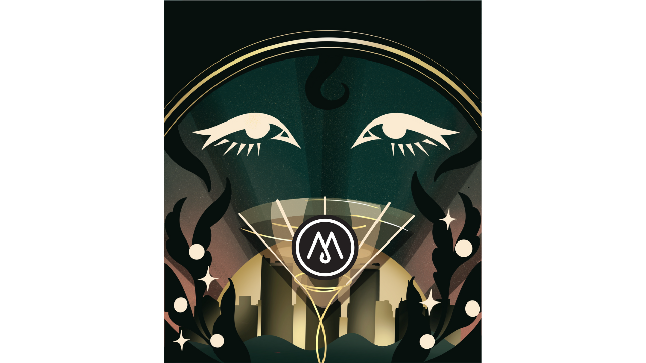
"With this design, I aimed to seamlessly blend elements of urban architecture with nature, reflecting MAWBY’s expansion into Detroit while incorporating influences from the Leelanau Peninsula."
"The grape leaf-inspired motifs on the sides symbolize the brand’s roots in winemaking, while the cityscape showcases Detroit’s iconic skyline. Additionally, the design draws from the rich Art Deco heritage found in Detroit’s architecture, honoring the city’s history and aesthetic legacy. The shimmering gold accents represent both the vibrant, sparkling nature of the beverage and the luxurious experience of enjoying sparkling wine. At the center, the eye motif serves as an elegant and feminine focal point, drawing in consumers and inviting them to take a closer look at the bottle."
"My goal was to create a design that feels chic and sophisticated yet warm, inviting, and celebratory—capturing the essence of MAWBY’s brand and its connection to both tradition and modern wine enthusiasts."
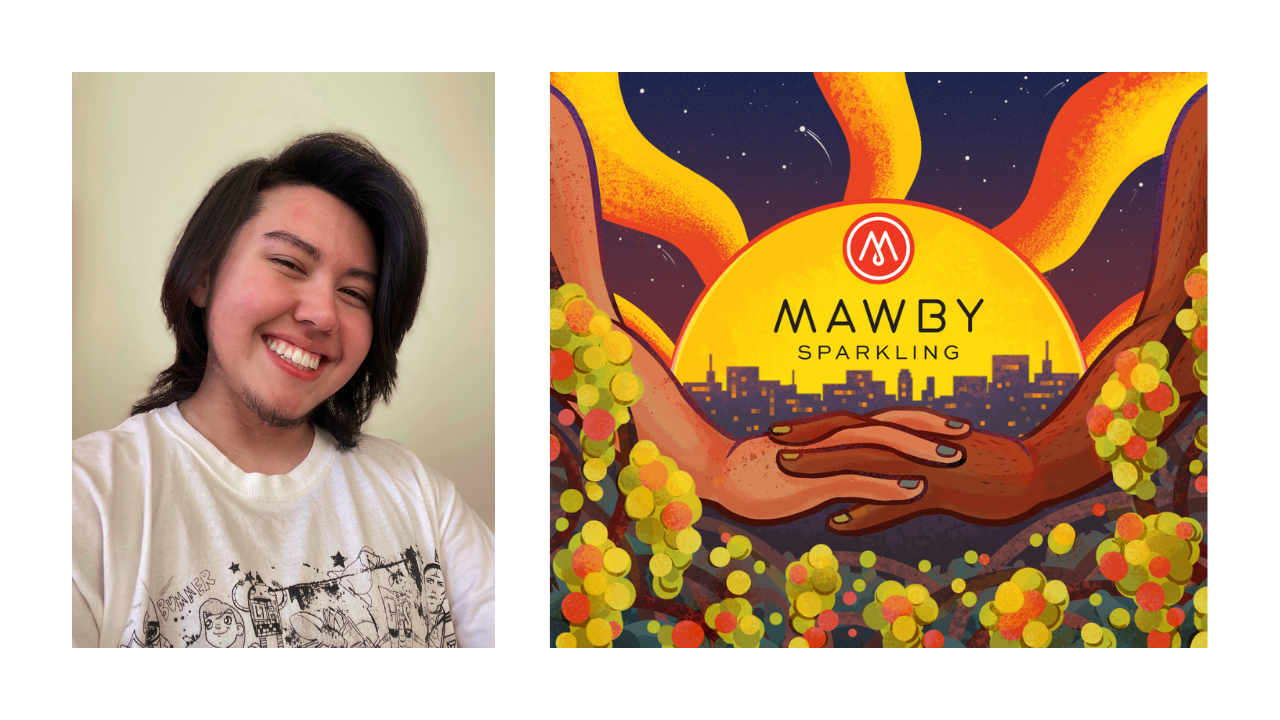
"MAWBY’s brand specializes in “making moments sparkle.” To reflect this motto, this design focuses on celebrating community, diversity, and savoring the moment. I wanted to emphasize the brand’s essence of connection between: diverse individuals; nature and urban life; and community and winemaking."
"These connections are shown via hands intertwining at the center of the image, representing inclusivity and a transition between a far-off cityscape and a flourishing grape vineyard. The city skyline is inspired by Detroit’s urbanscape, while the green grapes portray the source and type of wine in the bottle. MAWBY’s branding features a lovely variety of saturated colors, so I aimed to present this array in a balanced, symmetrical design."
"A sun is used to frame the majority of the image, adding warmth and energy to a tranquil scene. The bright yellow against a darkened sky adds contrast, making the design more eye-catching from afar. MAWBY’s logo is featured center, allowing illustrative elements to act as support for the branding’s narrative. As a final touch, the stars are a nod to MAWBY’s specialty in sparkling wine. When it comes to a drink as celebratory as sparkling wine, I hope for this design to feel like a reflective moment; a reminder to enjoy life’s little luxuries in the quiet moments, and create meaningful memories in good company."
"For MAWBY, I wanted to provide a design that embodies the bright energy of the brand while celebrating the joy of sparkling wine."
"Using vibrant colors and bubbly, abstract shapes, I aimed to reflect the effervescence of the wine itself. Inspired by the spirit of Detroit, I incorporated elements that celebrate the city while keeping the composition playful and dynamic. This illustration is meant to feel fresh, inviting, and reflective of MAWBY’s lively identity."
"Tasked with bringing “MAWBYness” to life, this piece marries the different elements the brand stands for: MAWBY's care for nature, which they showcase with their sustainable business practices; their mission to bring people together as a community in joyful moments of celebration; their efforts to give back to Michigan communities; and their support for Detroit and involvement in the community."
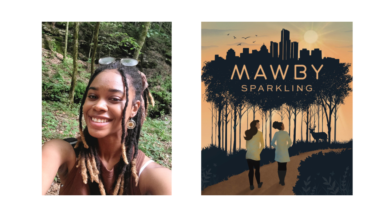
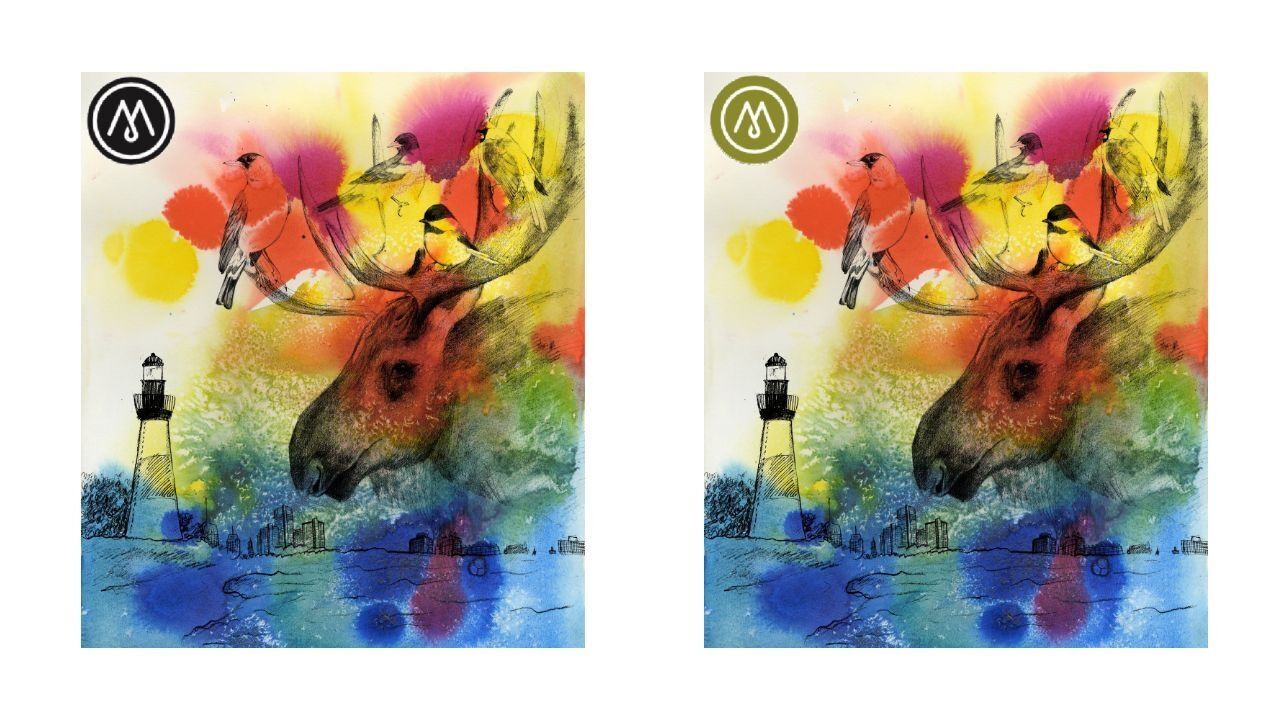
"This label reflects the harmony between nature, community, and the connections that bring us together. Inspired by MAWBY’s home in the Leelanau Peninsula and its bond with Detroit, the design weaves elements of both worlds—where city and nature intertwine."
"A deer rests within the tree’s branches, birds glide above the skyline, and butterflies flutter in the foliage, all surrounding two young figures strolling at sunset. Their warm presence evokes shared moments, a sense of belonging, and celebrates the unity between people, place, and the joys that bring us together."
"The golden hues of the illustration suggest a wine perfect for autumn gatherings, radiating warmth and nostalgia. I imagine this label adorning a sparkling wine with crisp notes of apple and warming spices—flavors that complement the season and invite a sense of comfort." "Just as the artwork tells a story of connection, the wine itself represents bringing people together in celebration of the changing season."
Other News
See More News